Toil and Play in the Painting Process
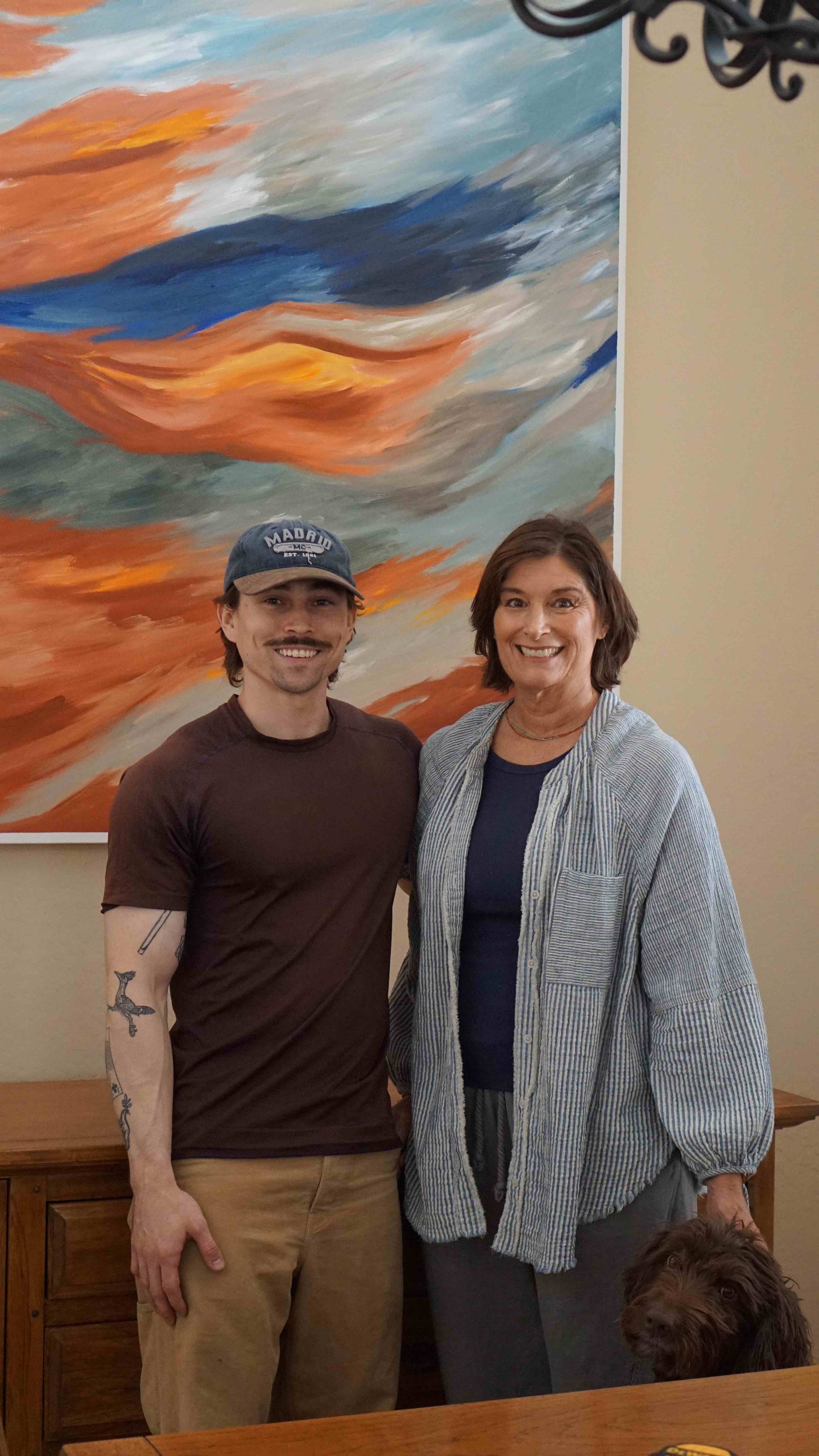
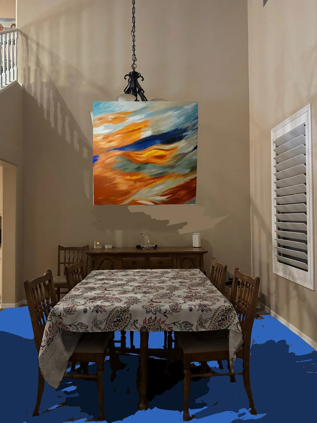
“Wow, I just saw it and it took my breath away,” Janell told me as I brought my tools through the door to home in North Phoenix.
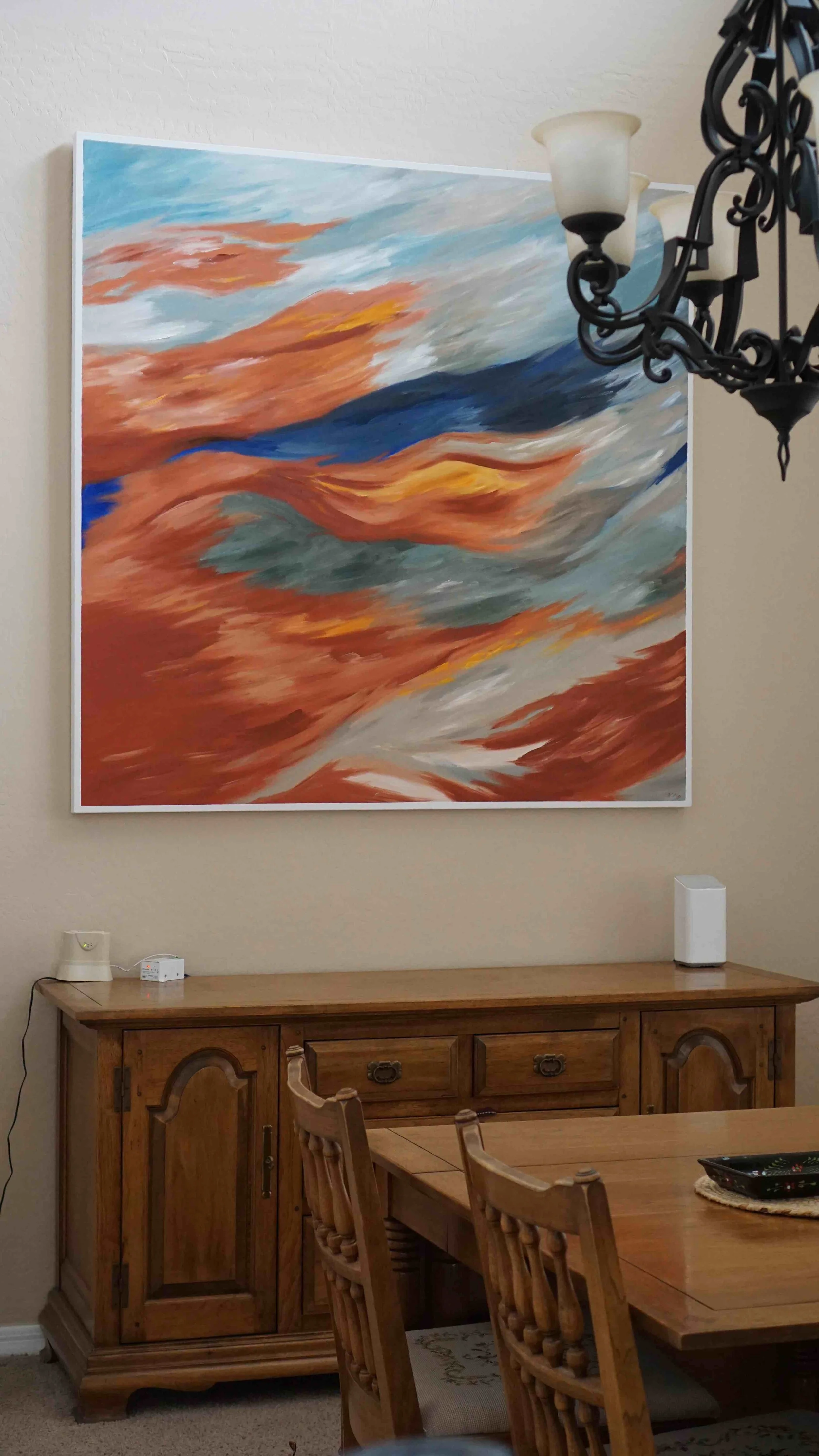
I had already brought in Arizona Abstract Sunset 1, which was resting next to her window, waiting to be hung above her buffet in the dining room.
“I’m glad!” I replied as I broke out the tape measure. She already had nails in the studs in the wall from a previous piece, so I saved a bit of time to identify exactly where to hang it. I picked up the painting for the last time, holding it in the spot where it would rest and reflect light from now on.
We measured the height and I calculated how to hang it on the wire to leave 16” above her buffet. The painting was expansive in her space; she had expressed early doubts about if it was large enough for the room. I assured her that a 60”x60” piece would fit well, mentioning that most clients think they need something larger.
"You know, in real life, it doesn’t look too small,” she said as I leveled the painting on the wire.
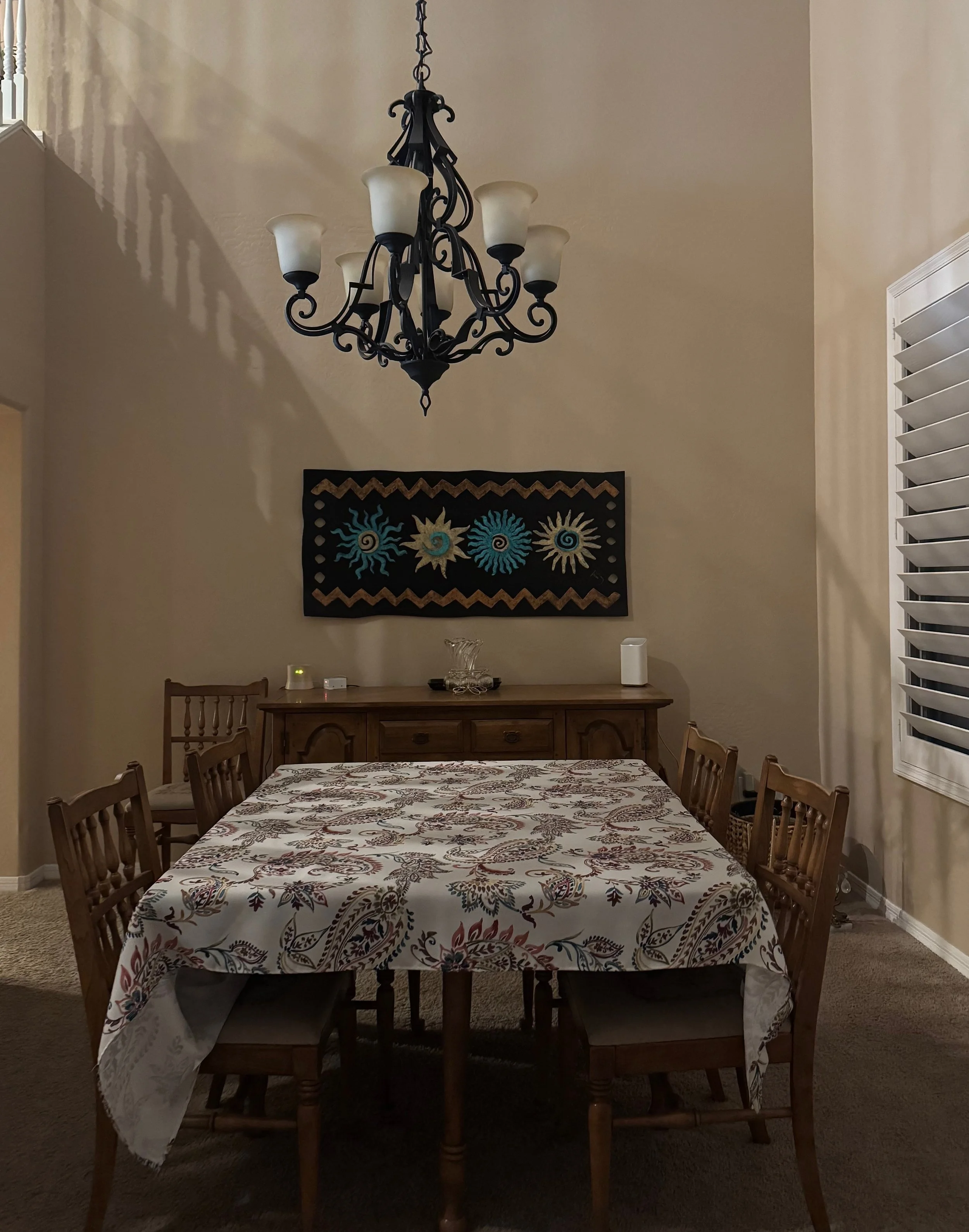
I mentioned to her how often that happens. We had gone through the steps to confirm everything ahead of time—she pitched a few walls to me via text, and I sent her back some rendered images of the painting in her room at scale (with the floors painted blue to match the tile she’s installing). To her credit, it isn’t a perfect system, and it did look smaller in the photos. But now it was finally in her space!
“Oh, it looks so good! I love it, are you going to do more?” she asked.
“Yes,” I said, then I told her about the commissions that I need to get through before I’ll do more on my own accord.
Speaking of which…
Commissions pose an interesting challenge, because there are a few ways to make a compelling painting, and many ways to make a mediocre painting.
To make a compelling painting is often about exploring contrast. The contrast that I’m noticing lately isn’t that which exists within one specific painting, but across multiple pieces. Paintings turn out when they are either laborious and haunting, or when they are effortless. Rarely do I make a compelling painting when I paint in the in-between— the effect is similar to the result of muddied colors and blurry, unconfident lines.
Commissioned pieces often distort our view of which path we’re walking. It’s almost always prophesied early— and the challenge is learning which path we’ve started down. Such was the case between my latest two pieces.
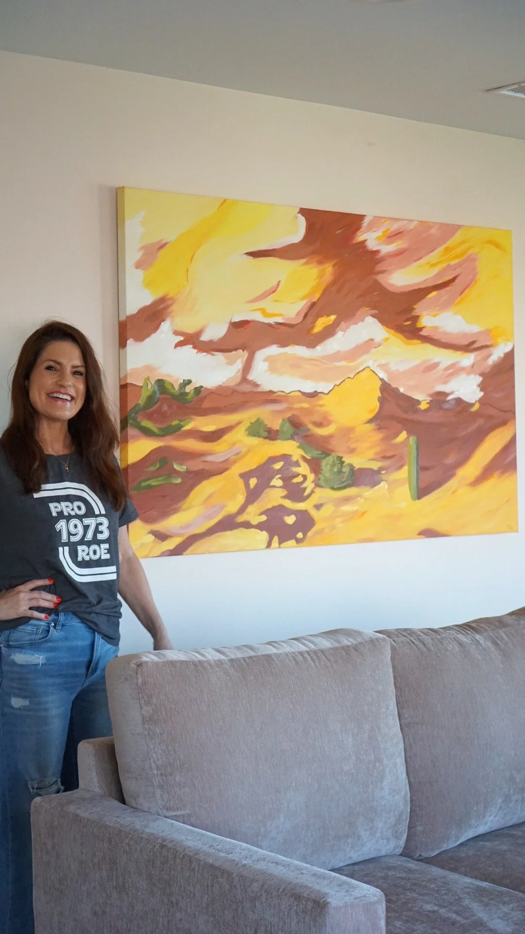
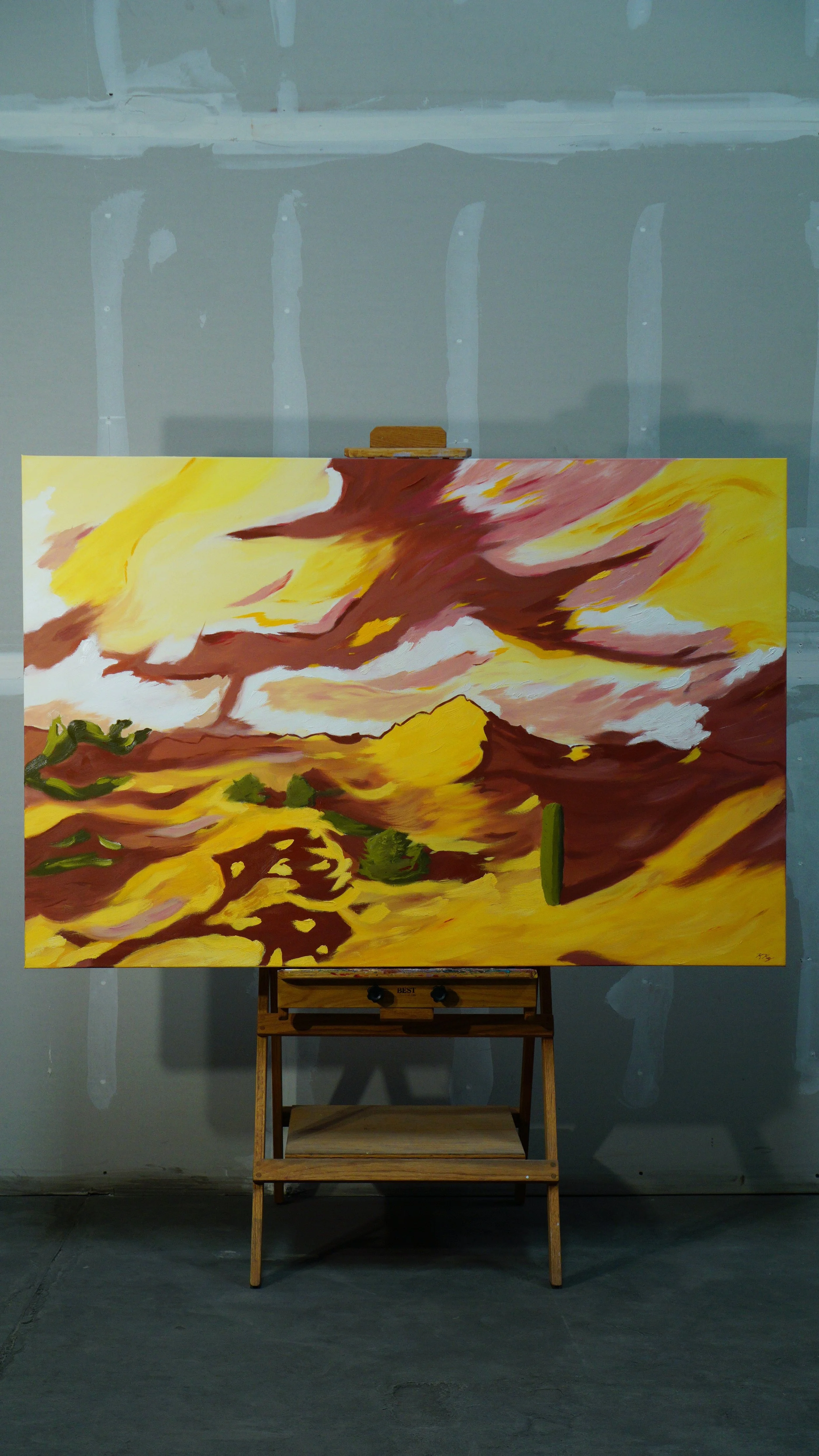
Christina’s piece flowed off the brush. I rolled the inspiration right into the palette, rarely taking a break to contemplate; the thoughts of “what’s next” always came from that familiar gut feeling which has guided most of my artistic career. It’s a simple knowing of what to paint.
I had initially met Christina over coffee at my studio, where she told me her aims to have a painting full of terracottas and yellows for her Arizona room. I took notes and provided her a game-plan. She approved my concept and designs, and as soon as I moved into my new studio, I got to work.
It was almost as if it was obvious what I needed to do at each step. Still, there were concrete choices to be made under serious deliberation. I don’t want to understate the efforts that went into her painting—it’s just that those choices were made subconsciously and automatically, nearly out of my control.
I’m thrilled with the result—the hard lines between abstract shadows in the landscape pulls my eye one way, then I’m drawn to look at the mix of oranges which flow across the sky. The piece fits perfectly in her evolving space; we hung the painting facing the mountain it portrays!
With Bo and Lauren’s piece, I had a false start. I thought I was ready before I was.
We went through many different concepts and renders, finally settling on something inspired by Cézanne and Matisse. We had explored their existing collection of art, and they explained to me what they liked, providing examples of broken color pieces and other Impressionist paintings. They told me they wanted something with pastels, pinks, and blues.
I made color studies and sketches, then I started on the large 40”x60” canvas.
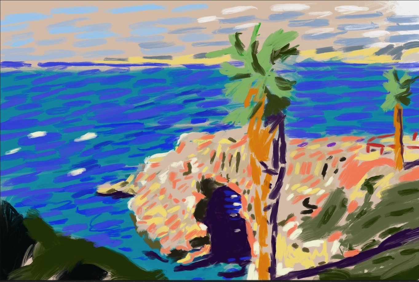
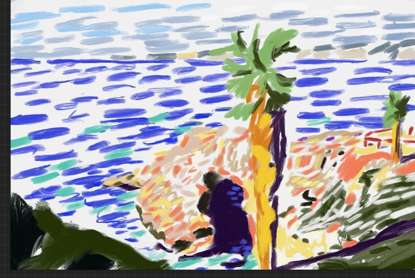
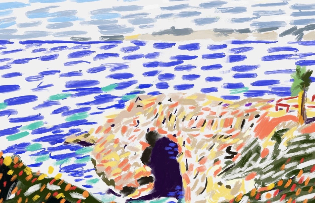
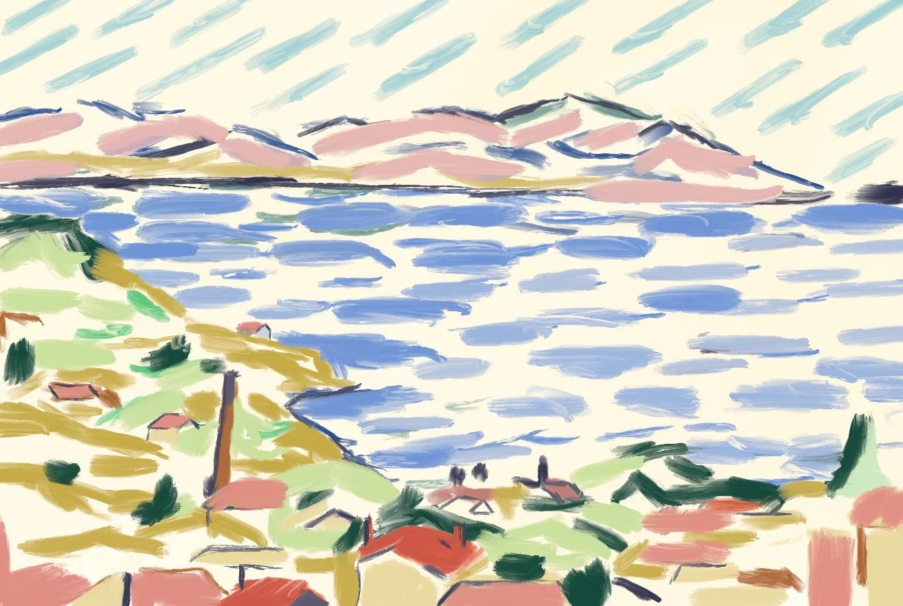
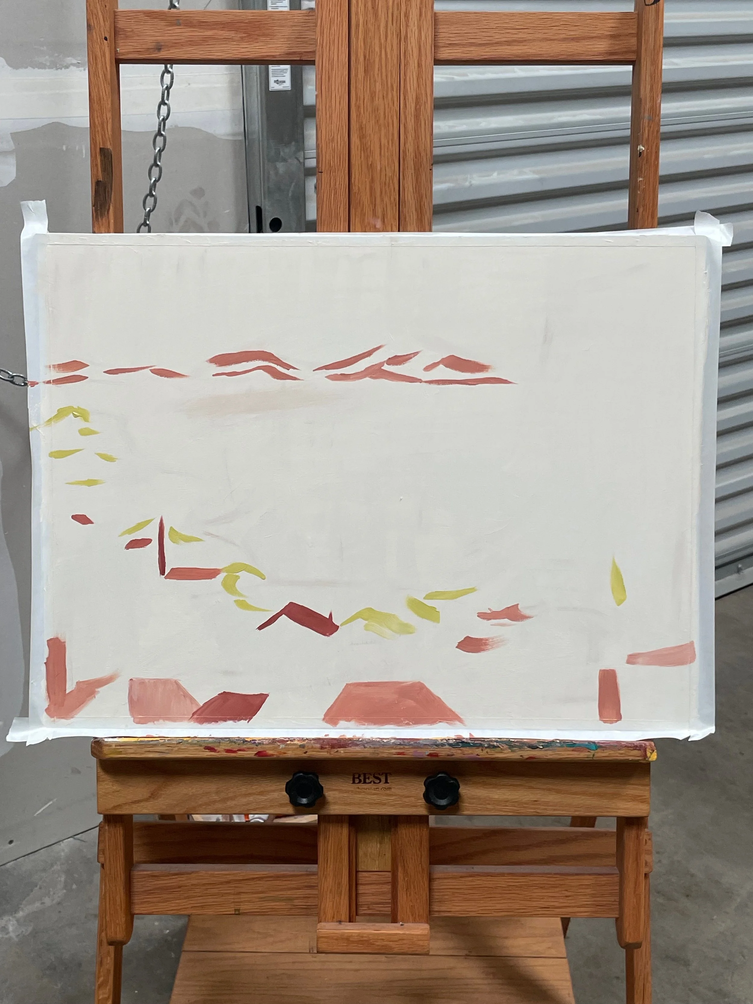
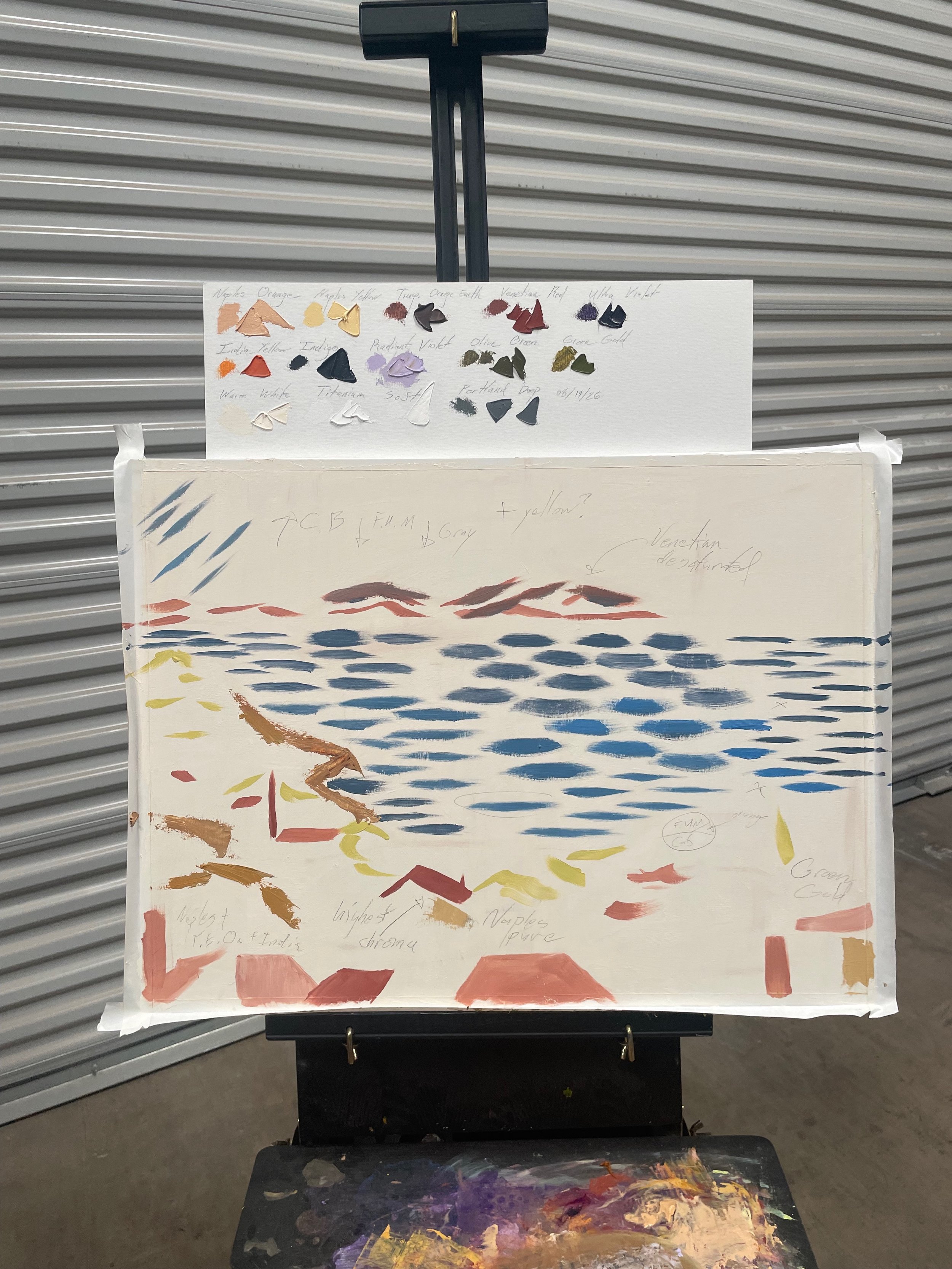
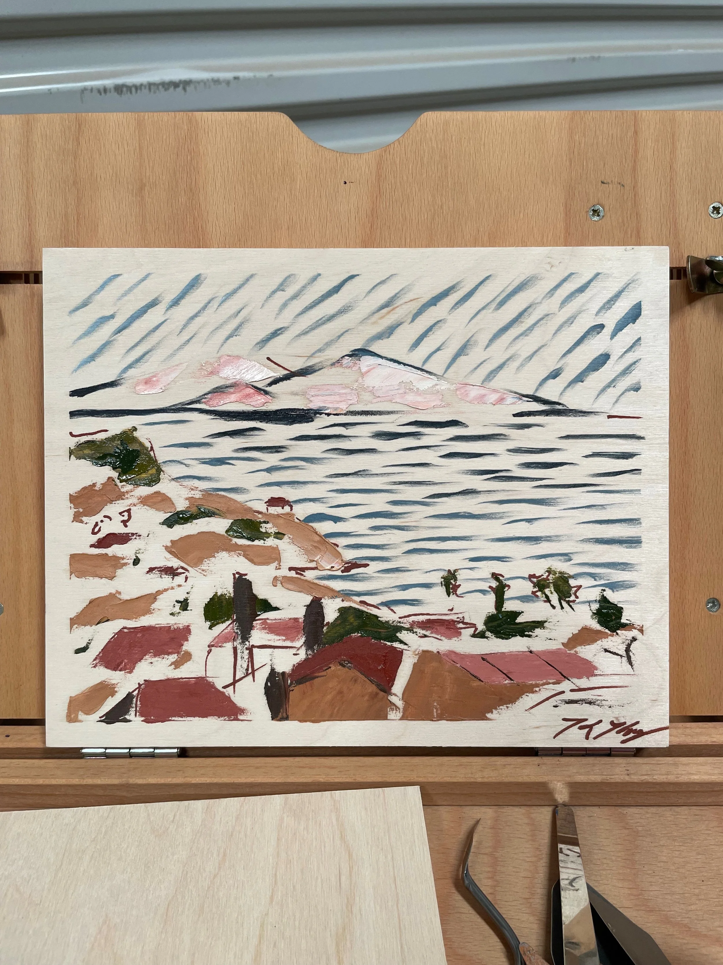
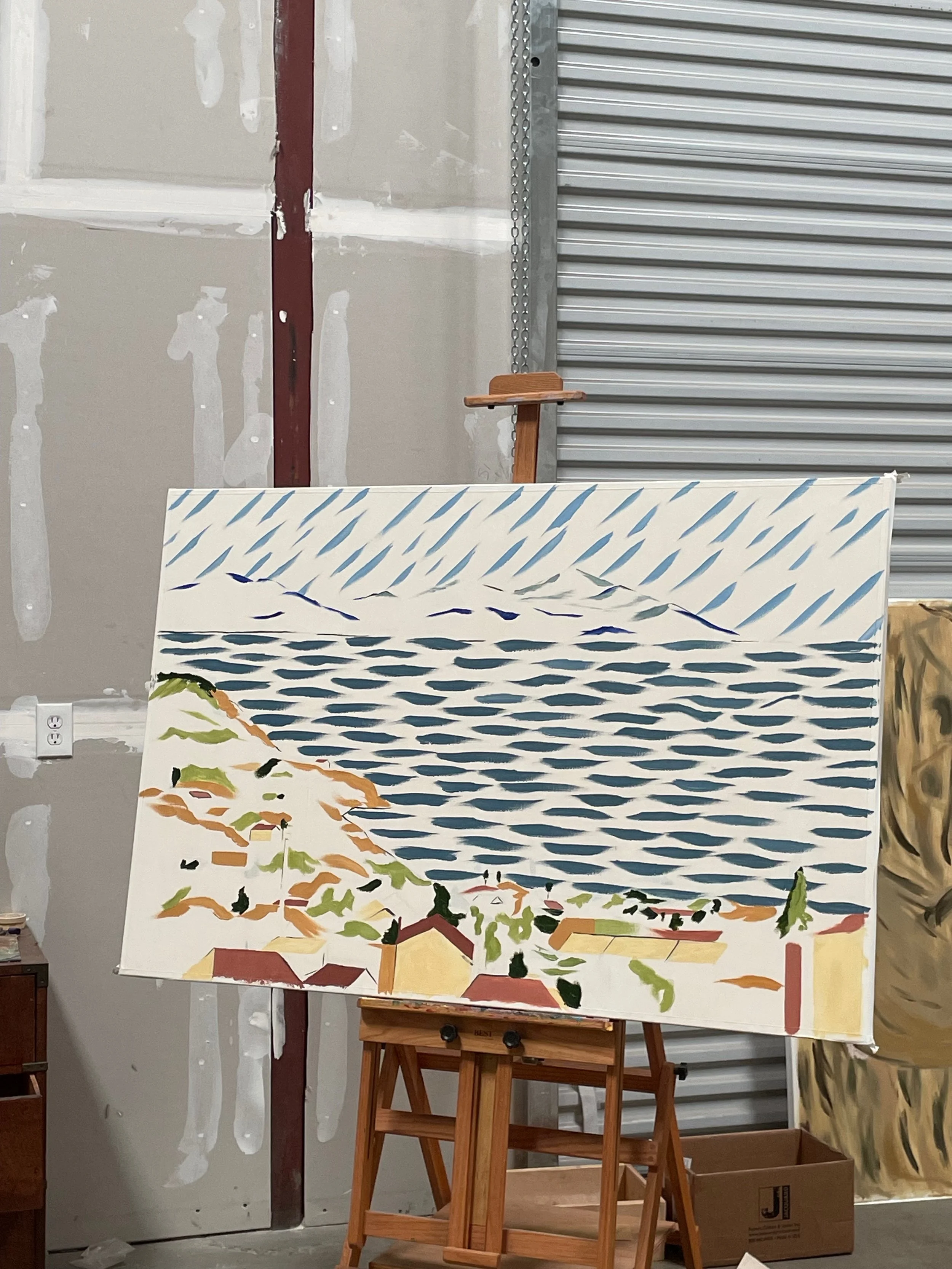
I was excited to try something new with broken color and ample negative space. However, I really struggled to combine every requirement and make a compelling painting. I wanted to make something that I knew would work with their home, depart from my usual style, and strike my own measure of quality.
The main difficulty was in the negative space; I needed brushstrokes to be one-and-done with no edits.
Looking at the half-done painting, I paused. I remembered that it’s important to explore and test new roads when you’re creating, and to defer the role of “editor” until movement is done. The pressure of a commission can paralyze you from producing anything at all if you let the editor in too early.
Still, it’s important to be OK with making something and letting it fall apart, which is exactly what happened; my first full-size draft was mediocre.
I collected my thoughts and realized what went wrong, so I started fresh.
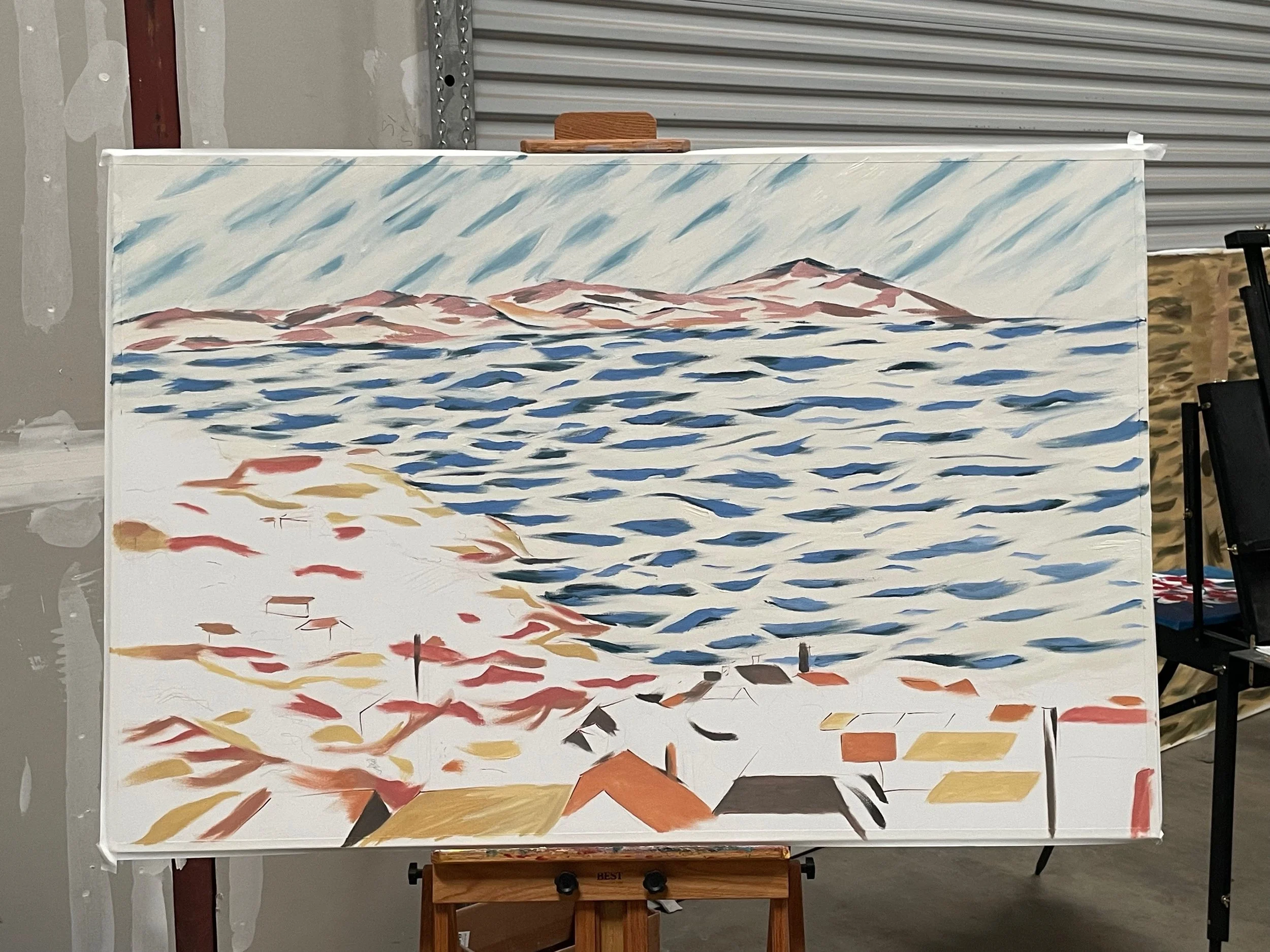
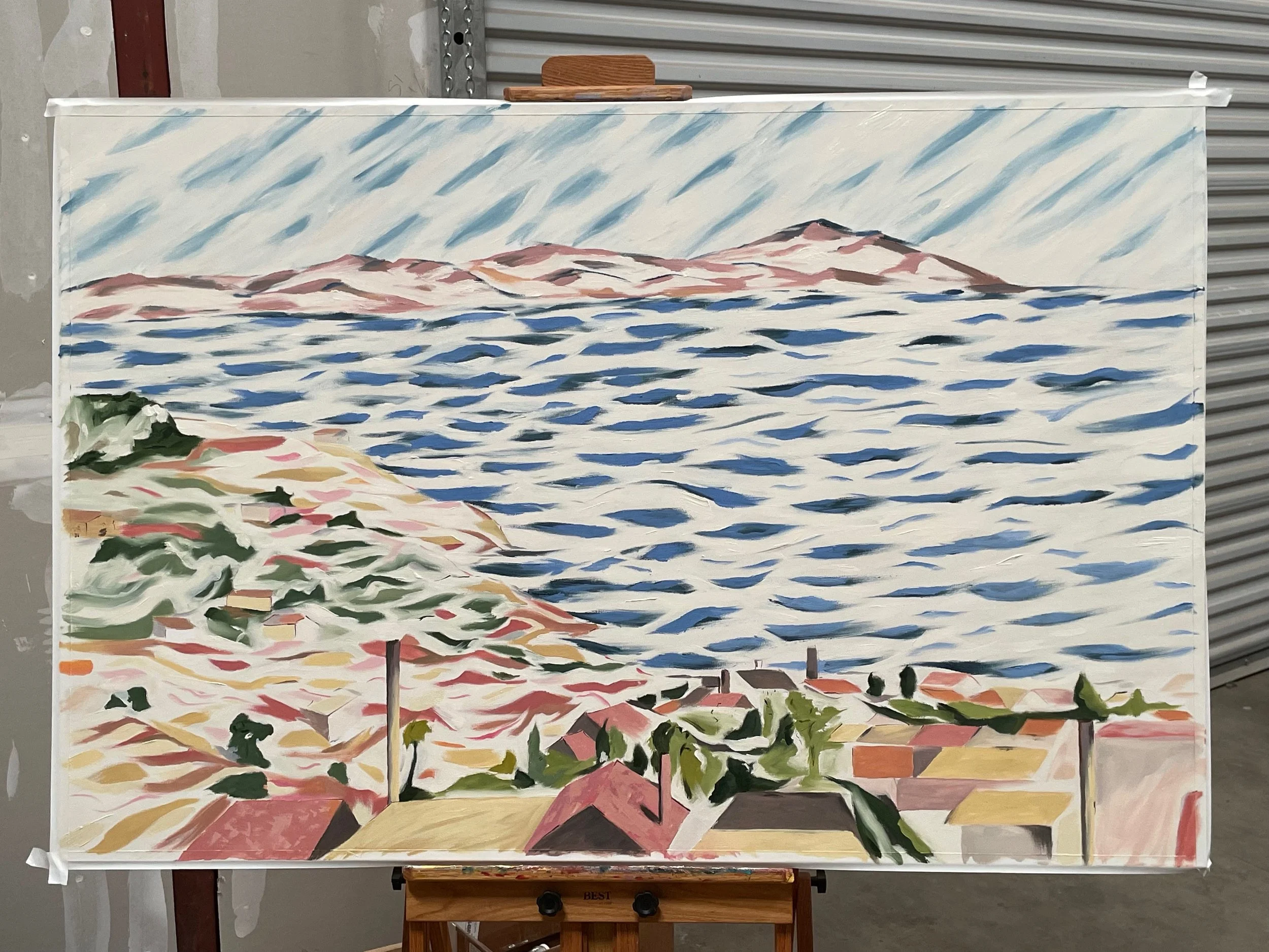
I’m happy with the result. There were threads I explored in my second draft: I wanted to accentuate the delineation between natural and man-made. There’s a sense of flow and blending to the brushstrokes in the ocean and trees and sky, while the houses feel almost harsh in comparison with their hard edges. But this natural-to-artificial line is not strict, and almost gives a sense of harmony with nature; the ocean still has hard lines and edges. The buildings and man-made constructions are made of the same soft palette. It almost gives me the idea that we knew what we were doing 200 years ago; we didn’t make our structures from materials so synthetic. They were harmonious with the materials of the earth.
The alternating density in the ocean came to me upon considering the direction of light. It’s an inviting place to gaze after my eyes cross across the deeper, partially-mixed blues of the left side of the ocean, then up and around the mountains.
I compare it with my first pass, which had lines more uniform, but the result was sterile. It lost the sense of light reflecting on the ocean. It lost the sense of movement of the waves into the hillside. The painting had little sense of play to it.
Thus it needed to be cast aside so that a better painting could live.
These pieces monopolized my focus for the past few weeks. I usually pour a lot of energy into drafts in oil— sometimes, I make something and it turns out “right” the first time. Very few paintings go without any edits, but some lend themselves to editing. For my first draft on Bo and Lauren’s, I found it difficult to continue— no color corrections, no going back over a poorly-executed line, which gave it rigidity and anxiety. For the second pass, I was far more free-flowing with my brushstrokes, working into wet oil and scraping away at that which didn’t belong. In Christina’s piece, the layering lended itself to modifications; I added pinks to the near-complete sky as a finishing touch.
I don’t have to always produce quality, but I challenge myself to edit and curate ruthlessly—it’s imperative to me that I only send patrons home with work which meets the bar.
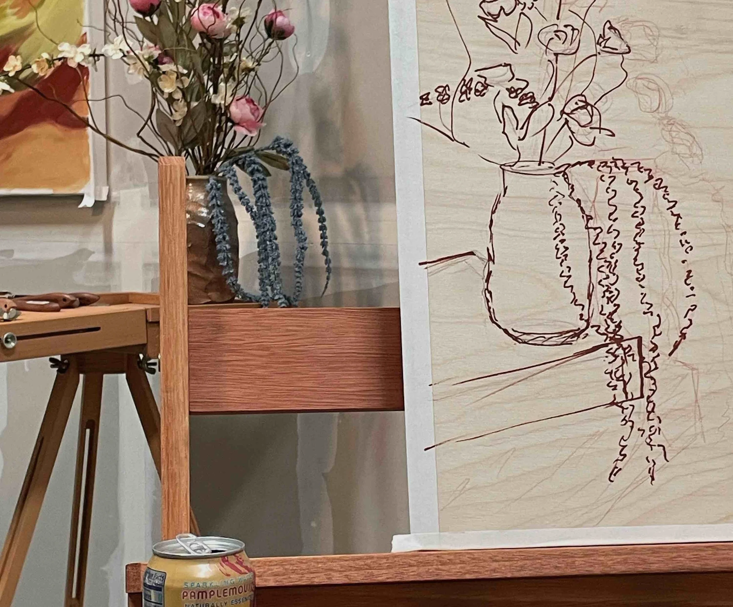
That said, I’m working hard on collecting inspiration and ensuring that my next pieces go well. I have a few things in the works— I’m sure that some of my clients are waiting patiently on their paintings, reading this, wondering where things stand:
I’m gearing up to enter the “artistic choices” stage of Lavender Fields for Ces. So far, I’ve done a lot of groundwork and structuring, plus palette corrections. This one is in my usual style, so it’s a bit more straightforward— I can get into a flow state and let it roll.
I have sketches going for Barb of her still life and ceramics. The initial draft I made on a panel feels too dense. I’m modifying the subject so that it’s in alignment with what we spoke about— more sparse florals in a “smouldering” palette.
For Janie, I got back into the rhythm of painting large abstract work by drafting out an AZ-desert-inspired piece which I’m still working on (but deferring for now). This piece showed me what elements of the palette I don’t like, and what doesn’t match the inspiration of a monsoon afterglow. I’m planning on going much grayer for the large piece so that the saturated colors pop. I’ve chosen a second palette to explore with indigo grays, subtle browns, bright reds and Naples yellow.
For Jason, I’m still sketching. The eye path for the viewer isn’t obvious to me yet—I typically explore color contrast, texture contrast, or sharp lines to guide movement.
I’m cooped up in the studio while these projects unfold! Thanks for reading!